
2024
Branding
Illustrations
Web Design

About Sarla
Sarla is about reviving the dying crafts. The brand empowers local artisans and small businesses, showcasing their exquisite handicrafts to a global audience. Each piece tells a story of cultural heritage and skilled craftsmanship, offering a unique alternative to mass-produced goods.
The brand
The brand focuses on a grounded and natural lifestyle - promoting handicrafts sourced from materials found in nature. It also provides a platform for local artisans and small business owners to showcase their work on a global scale.
Who is the target audience?
Anyone looking to live a healthy, ethical and sustainable life - Sarla offers products that range from herbs, message tools, fashion to home decor.

Initial ideas
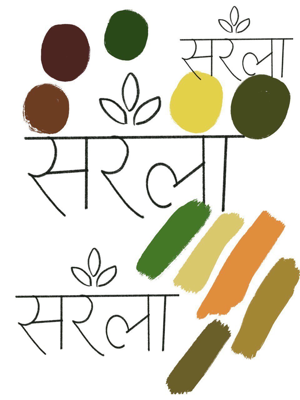
When conceptualising this logo design, I wanted to create a visual narrative that seamlessly blends natural elements with cultural depth. My approach was intentional in crafting an emblem that speaks to holistic wellness through thoughtful design choices.
Visual Storytelling through design elements
Emblem structure
I chose an emblem logo to communicate tradition and timelessness. The structured format allows me to compress the brands complex ideas into a singular, powerful visual mark that immediately communicates it’s essence.
PRIMARY LOGO
SECONDARY LOGO
SUBMARK
FAVICON
Iconographic language
The three generic leaf shapes were a deliberate minimalist choice. By using a universal leaf form, I've created a design that suggests:
Natural abundance
Interconnectedness of elements
Simplicity in complexity
Cultural authenticity
Integrating Devanagari script wasn't just a typographic decision - it was about anchoring the design in cultural roots. The script adds layers of meaning, connecting the visual identity to rich traditional narratives.
Colour psychology
My colour palette of warm earthy tones was meticulously selected to evoke:
Warmth and approachability
Sense of grounded-ness
Invitation to a healthier lifestyle
Organic, natural energy
PRIMARY PALLETTE
SECONDARY PALLETTE
Design Impact
The result is more than a logo - it's a visual invitation. An emblem that doesn't just represent a brand, but tells a story of wellness, natural harmony, and cultural connection.
Illustration pack
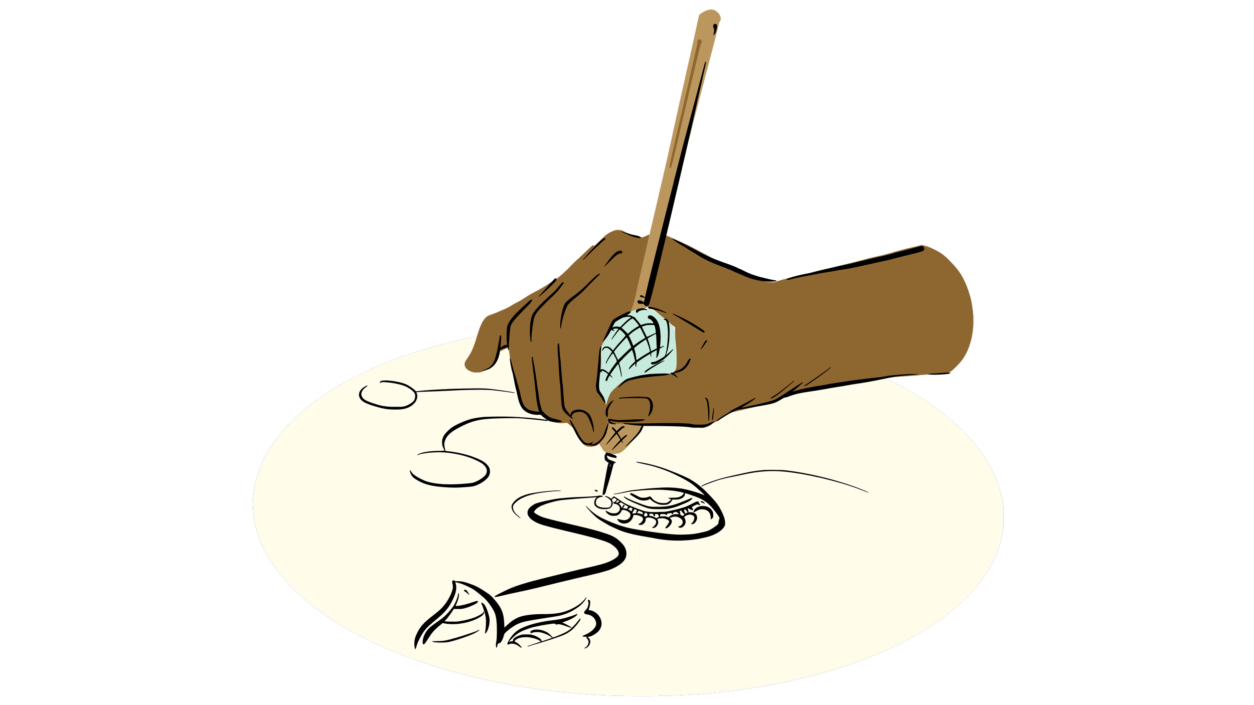
In creating this illustration pack, I aimed to bring the rich world of traditional craftsmanship to life. My goal was to showcase the beauty, skill, and diversity of artisanal work, aligning perfectly with our brand's ethos of celebrating handmade crafts and cultural heritage.
Software used: Procreate
Capturing the essence of artistry
I focused on illustrating artisans in action, each absorbed in their craft. This approach allowed me to highlight the human element behind each product, showcase the concentration and skill involved in handcrafting, create an emotional connection between the viewer and the making process.


